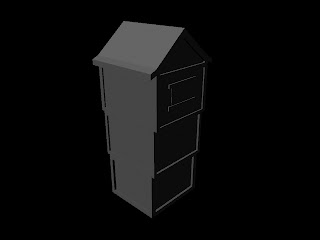
Deon and Dom have rendered the scenes and added the animation. The last thing to do is put it together with the sound and foley. I cannot wait to see the final film but I will not see them until after the deadline. The scenes and lighting that was used made our models look really good so kudos to Deon and Dom. I think that is pretty much the end of the project. Just waiting to see the final film.
Onto the next project...
Animation
Tuesday, 11 January 2011
Friday, 7 January 2011
Texturing
I have fully UV mapped my house and now textured it. I have sent it away to Deon to get textured as well so it will fit in with our scene (so its the same wood etc). I decided to have a go myself too just to see how it would look with my UV map and textures I would use.
I began with the door as it was small and quite simple. I UV mapped that very quickly and managed to find some seamless wood textures for it.
This is what my UV map looked like after I took it into PhotoShop and applied the relevant textures.
I was pleased with how quickly I achieved this but thought there would be a catch. Thankfully there wasn't and I was pleased with how the final door came out - after the texture was applied. The picture below shows the finished door.
My next task was the house. I had already UV mapped it which had taken me three days because of all the detail. All those beams almost killed me. It was like fitting together a very tedious jigsaw puzzle but I did it. Again I had to take it into PhotoShop and add the actually colour. I used the images I had for research and made my decisions from there. The wood for the beams I wanted to be light. This was to contrast the door but also because I wanted a timber kind of colour and I found the perfect texture for that. I then needed to add the white colour. I tried with pure white but it was too bright so I ended up with a very light grey which made the house look really good. For the roof, I found a red tile colour and applied that to it. It Came out really nice and clean too.
Here is the UV texture:
After a few slight adjustments, It came out quite nicely on my model. Below is my final textured model. There are more textures on the windows, to make them see through, and the crosshatching on the windows to make them look more like lead.
I am pleased with the way it has turned out.
I finally moved onto the trees. When I began they looked like this:
All the leaves are little planes, so I made a leaf texture in PhotoShop and then saved it as a PNG with a transparent background. This meant that when I used it as a texture, the background will still be transparent, leaving just the leaf there on the tree. The trunk was not a very nice texture so I made a texture and applied it to make it look like a birch tree.
This was the end result.
I think they look like quite good trees.
There is nothing really left for me to do. I have spoken to my group and handed over all my models and textures to Deon for him add and render the street scene. Dom is doing the animation and then using hers and Deon's machines to render (as they are beasts). So it looks like my work is done.
Wednesday, 5 January 2011
More Progress
After I had modelled the house an completely finished it, I began to start UV texture mapping it.
It took such a long time to fully texture map it. Because of all the beams on the front, I had to add every side of the beam as well as the fronts and the backs and the roof. The rest of the team has textured theirs so they want to use the same style of textures. I have passed on my model and my texture map from them to add the different maps (texture, bump, diffuse etc) to it and then add it to the street to create a whole street for the rat to run around in.
I have tried to upload the image of the UV map but the image will not up on the blog because the lines are too thin.
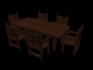
I have also finished modelling and texturing the dining table and chairs. I used the dark wood that I wanted to and spent lots of time making sure the grain was the correct way by UV mapping the table and chairs.
I sent this away to the group but they already had another in place and decided to use that one instead as it saved importing and extra tweaking.
The group have asked me to create some trees. to add to the scene.
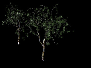
I looked at some tutorials online and then used the paint effects to create the trees. I had to tweak them a bit, by turning it into polygons and changing the texture of the leaves. I had to create the textures on PhotoShop and then export them as PNG files to make sure the backgrounds were transparent. This made the trees look pretty respectable. I may change the texture of the trunk because I'm not too happy with it.
Progress is looking better. As a group we are almost done and soon will begin animating.
It took such a long time to fully texture map it. Because of all the beams on the front, I had to add every side of the beam as well as the fronts and the backs and the roof. The rest of the team has textured theirs so they want to use the same style of textures. I have passed on my model and my texture map from them to add the different maps (texture, bump, diffuse etc) to it and then add it to the street to create a whole street for the rat to run around in.
I have tried to upload the image of the UV map but the image will not up on the blog because the lines are too thin.
I have also finished modelling and texturing the dining table and chairs. I used the dark wood that I wanted to and spent lots of time making sure the grain was the correct way by UV mapping the table and chairs.
I sent this away to the group but they already had another in place and decided to use that one instead as it saved importing and extra tweaking.
The group have asked me to create some trees. to add to the scene.

I looked at some tutorials online and then used the paint effects to create the trees. I had to tweak them a bit, by turning it into polygons and changing the texture of the leaves. I had to create the textures on PhotoShop and then export them as PNG files to make sure the backgrounds were transparent. This made the trees look pretty respectable. I may change the texture of the trunk because I'm not too happy with it.
Progress is looking better. As a group we are almost done and soon will begin animating.
Thursday, 23 December 2010
Progress
Progress has been very slow over the past month. This, I believe, has been due to everyone including myself, winding down because of the end of term and getting ready to have a bit of a rest for christmas. I havent been doing much during my time at university because, to be honest, there always seems like there are funner things to do. This has been fatal to my workflow.
I have finally finished my house and added more much more timber and textured the window and the lead which is cross hatched on the front. It will take me a long time to texture and UV map it because of all the timber. I think it may have been better to use a different method which would have made texturing easier.
The method I used was to create additional faces by using the 'create edge' tool and then extruding them out. What would have been much easier would be to just create a cube and texture it and then add the beams as separate components. This would have meant I would be texturing cuboids and could move the timber around more. It would have also made texture mapping easier.
I have also modelled the chair which is in the style of the era but that also needs to be textured. I have volunteered to make the whole dining table as well as all the chairs and I can make them in the same theme. I am going to texture it all in dark wood which gives it an older look.
This is my chair that I have modelled.
Over the holiday I am really going to have to work harder to get this done.
I have finally finished my house and added more much more timber and textured the window and the lead which is cross hatched on the front. It will take me a long time to texture and UV map it because of all the timber. I think it may have been better to use a different method which would have made texturing easier.
I have also modelled the chair which is in the style of the era but that also needs to be textured. I have volunteered to make the whole dining table as well as all the chairs and I can make them in the same theme. I am going to texture it all in dark wood which gives it an older look.
This is my chair that I have modelled.
This is a shot of the dining table and chairs that I have modelled with the same theme. LIke I said above, I am going to texture them in dark wood to make it look better. This dining table and chairs were most likely used by slightly wealthier families but will still fit in our scene.
Over the holiday I am really going to have to work harder to get this done.
Tuesday, 7 December 2010
Modelling
I have got quite far in modelling the house. As a group we have agreed on the scale and have all made sure we are working in metres. Progress could be faster but I am finding it hard to find time at the moment. I have almost completed the house but I am looking to improve it with lots of beams. I have added a texture on the window to make them transparent and added the cross hatching on the windows as wells as giving them a lead texture. I also created a door which still needs to be textured.
Another thing I have been asked to do is model a chair. This is quite quick to do and I can use my research from the museum of London as I picked up some images of some from there.
I think progress is slow at the moment but I aim to pick up the pace soon.
This is a close up of the windows
This is a close up of the door I have modelled.
Another thing I have been asked to do is model a chair. This is quite quick to do and I can use my research from the museum of London as I picked up some images of some from there.
I think progress is slow at the moment but I aim to pick up the pace soon.
Saturday, 20 November 2010
Production
So I begun to draw up some basic concepts. I have based it on the photos of the houses and the pictures from rochester. The house look very top-heavy and very light. They are half timber with white render in the walls. I am only putting a lot of detail on one side of the house, as the other sides will not be seen as the houses are close together and cramped up.
I have also begun to start modelling a basic house. It is only a basic block shape at the moment but I need to add the timbers going down the house. I also need to add windows and a door.
I will put the pictures up of concepts as soon as my scanner decides to work again.
Slow progress so far.
I have also begun to start modelling a basic house. It is only a basic block shape at the moment but I need to add the timbers going down the house. I also need to add windows and a door.
I will put the pictures up of concepts as soon as my scanner decides to work again.
Slow progress so far.
Wednesday, 17 November 2010
Concepts and storyboards
I have drawn up some concepts for my house. After a group discussion we have decided to all model a house to begin with and then duplicate them to make a street. They will be rearranged in different orders so that they are not obviously the same houses.
We have also agreed on a storyline for the animation. This was an idea from Gerome which we all adjusted and added input to create the final storyline. Dom then created the storyboard and it can be seen on the group blogs.
For my concepts, I have used the pictures I took from the museum and the pictures that Lily and Sarah took in Rochester. I have then drawn a house that would fit in around that time. I started with little doodles of components like the door knob and windows. This then developed into a full house. The pictures are all shown below.
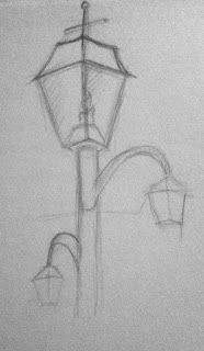
Below are some doodles of different parts of the scene from the era we are looking at. I have begun to look at the windows and doors and also had a rough concept for a lamp in the street, depending on the time of day.
I have started to think about the housing and the cramped spaces but, yet again, this is only rough sketches.
I have started to think a bit more about the sort of house I wish to model. This image is more of a shop window so will probably not model something like this but I am going in the right direction.
I have begun to design a house that I am going to model. It looks a little complicated but I think I will be able to pull it off. It is exactly the sort of houses we were all thinking about modelling and this is a good starting point. It still needs some development.
I have developed the house more. I have made it simpler and realised the the sides and back do not need to look too complicated. It is in the style we are after as it is half timber and will have white walls.
These have been developed again and have a colour style so you can see how the colours are going to contrast. The house on the left looks a little too simple so I am looking to model the house on the right.
With my concepts and designs, I can begin to model.
Subscribe to:
Posts (Atom)


